Landing Pages: 11 Key Design Tips For Crazy High Conversions
Every marketer should know that the landing page is very important as it is the key to converting your visitors into leads. Therefore, knowing the elements of an effective landing page will help to create a successful online marketing campaign.
There’s no actual manual on how to create the perfect landing page as there are many factors to consider. We can only test the elements in the landing page to see which ones are effective and have them arranged. However, we still think that the gist is actually on your landing page copy.
Different people convey message differently. So every landing page should have a different goal for every product or service. Let’s look at what it takes to strengthen your online marketing strategies and how to create high-converting effective landing pages.
1) Craft a Compelling Headline
This is the most crucial element of a landing page as it is the very first thing that people will see and read once they stumbled upon your landing page. Experts said that you have only 0-8 seconds to write a compelling headline and landing page.
Not only it has to be attention grabbing to bring your visitors to the page; it should describe what your visitors will get from the page. You wouldn’t want your visitors to be disappointed when they come to a page that doesn’t give them what they’re expecting, right?
It’s best to keep your headline at about ten words because let’s be honest. Nobody likes to read a big chunk of information when all they needed to know is what you have to offer. So don’t forget to make it sweet and short with value-driven words.
2) Use Subheadings and Bullet Points
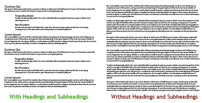
Once your visitors read the headline, the next thing they read is the subheading. Therefore, your subheading on the landing page should follow the primary headline to further elaborate what can your visitors get.
This is also where you should convince your visitors to stay on the landing page by adding the persuasive message.
If you’re not sure whether your message is clear enough to the visitors when stumbled upon your landing page, you can always ask a friend or colleague to read it and tell you what do they understand from it. Another method that I personally found compelling is to read the copy out loud. With that, I’ll be able to identify which part that I need to improve on.
Another good tip is to make your landing page scannable by using bullet points to explain the features of your product or service so your visitors wouldn’t spend too much time trying to understand your content.
3) Include Compelling Images and Videos

Studies have shown that our brain processes visuals 60,000x faster than text. We should take this opportunity to put in some images on your landing page so that visitors wouldn’t forget you easily.
Just like how we always add images into our blog posts, the purpose is to give a clearer idea to our visitors. The same thing goes to the landing page. Studies have also shown that using videos on the landing page can increase your conversions by 86%.
However, there are also other factors that you should consider when adding images on the landing page. Let’s have a quick run-through of them:
- Images should be related to your product or service.
- Make sure your images are large enough so that it wouldn’t be blurred when zoomed in.
- Tell a story with your images. Make a demo of how to use your product or tell the visitors how your service works.
- Avoid using generic pictures. Use the best stock photos and images.
4) Powerful Copy, Make Your Value Proposition Clear

An effective landing page should have a powerful copy with Unique Selling Proposition (USP) that explains the benefits of the product or service you’re offering. Make sure that your visitors will gain some value from your explanation. Rather than saying “we provide SEO services”, try “Optimize your website to drive more traffic”.
The landing page should emphasize more on the problem and how your product or service will solve them. With that, visitors can know how they will overcome their obstacles. So try to be as straightforward as you can.
If you’re not sure what you should write, you can combine all the key points from your headline, subheadline, and images to tell your story.
5) Ensure a Logical Flow
Just like you’re watching a movie or reading a novel, you wouldn’t want the story to be cut-off in the middle, right? Logical flow is another factor that marketers should not take lightly when it comes to landing page because once the flow is not there, your landing page fails to convert.
You should create your landing page for visitors to follow the process in order to be converted. Don’t let your visitors leave confused. Instead, be the solution to their problems.
To make sure the logical flow is there, read the content once you’re done with the landing page. From there, follow the thought process and analyze if the flow makes sense and ask yourself, “Can this landing page compel the visitors to use my product or service?”
Don’t be afraid to make a long-form landing page as studies have shown that long landing pages are highly effective and can generate up to 220% more leads. Most importantly, always start with an explanation of what your product or service is offering, the benefits, and end it with persuasive call-to-action. This logical flow will convert more customers than you’ve expected.
6) Focus on a Pain Point

It is more likely that visitors will convert when you cause them to think about their pain. Because then, they will look for the solution to seek relief from that pain. Imagine this. It feels good to get $100, isn’t it? But what about when we lose $100? The pain is twice as intense from the pleasure that we received the same amount.
This is where testimonials come in. Get some feedback or reviews from your customers who love your product or service and feature them on your landing page. They will mostly convey this pain honestly, resulting in gaining more trust from your potential customers. People who experience the same thing will find your product or service reliable as it has proven to help people with their businesses.
Remember this. Your product or service has to be the antidote to the pain. Don’t leave your users suffering in pain; you have to heal them. So draw a conclusion on your landing page by giving them a solution, an answer to the pain.
7) Trustworthy Customer Testimonials and Reviews

Like I mentioned above, testimonials are proven to be effective in converting prospects into customers. I have to admit this. No matter how great a product or service is, I will always read the reviews and testimonials from a real user to decide whether or not this product or service is worth the money.
A trustworthy testimonial can go a long way to cultivating visitor’s trust. So always use testimonials from real people. Don’t treat your visitors as a fool because fake testimonials can be identified easily.
The best testimonials are those that are backed up by figures, data, and real numbers. With the rise of social media, social signals will also make an impact in building your visitor’s trust.
8) Make Your Contact Information Easy to Find
“Hello, how can I contact you?” If you have been receiving this questions from more than five visitors, you’re making a big mistake.
Some of the most persuasive great landing pages that I’ve visited have complete contact details such as phone number, address, or email address. Additionally, put a contact form at the bottom of your landing page so that visitors can leave you a message.
Even better, put a live chat in a popup form if you don’t want your visitors to wait too long for your replies. However, some may not want to use a live chat as it could annoy some of the visitors. So do your homework and list out the pros and cons of having one, then you know what to do.
9) Provide a Guarantee

One thing that you must know – every customer loves a guarantee. It helps them feel reassured. I’ve seen the results. Being in the online marketing industry for years, trust me. I’ve do A/B testing with landing pages with a guarantee and the ones without a guarantee; you’d be surprised.
Landing pages designed with a guarantee have double the conversions compared to pages without a guarantee. So make sure to give your customers that and create the best landing pages possible.
I know, I know. You might be thinking that you can’t give too much guarantee or customers may take advantage of it and you’ll be losing business. But hey, just choose a type of guarantee that is suitable for your business that gives a win-win situation. Remember to place the guarantee statement close to the call-to-action for your visitors to act fast.
10) Craft an Amazing Call-To-Action (CTA)

After all the compelling copy, this is the most important element on your landing page. A call-to-action is the door to your business. The bigger it is on your landing page, the better.
An effective call-to-action doesn’t have to be just ‘Submit’ or ‘Buy Now.’ Instead, use something powerful, exciting, and persuasive. For example, ‘Get Your Free Ebook Now.’ Other than that, you can also use a contrast color on your call-to-action to make it different. Contrasting color attracts people’s attention and helps to compel the click.

Most importantly, put your CTA at the right place. You can use a few CTAs on a long-form landing page and position each of them at a different section of the landing page so that visitors can click whenever they’re ready to purchase your product or service.
(landing page examples) images
11) Don’t Forget the Thank You Page
Last but not least, a thank you page. To show your appreciation, always thank your customers for getting your product or service. They will love this as it indicates that you care.
As much as we all wanted more sales, we have to show how much we care for our customers. In a way, they’re also supporting us. You can also offer a discount of 10% off for their next purchases or give them some freebies upon the page.
If your entire landing page is effective in converting your prospects into customers, your business will bloom.
Start Designing Your Landing Page Now
A landing page is the best place to see all your efforts come to success. It is where people come when they want to know more about your product or service and when they’d like to buy, and then, you will make more revenue.
With each of these elements on your landing page, you will create a high-converting landing page. Don’t forget to do A/B testing as it is the most used method for improving your conversions. From there, you will also improve and understand your visitors better.
You can also do a few sketches of your landing page on a piece of paper, then move them around and pick your favorite one. How to create high converting landing pages? Here’s a quick checklist to help you create an effective landing page:
- Create a strong headline to catch your visitor’s attention.
- Make sure to include your unique selling proposition in the subheadline.
- What makes you different from your competitors? Put all the features on your landing page to keep your visitors interested.
- List out the benefits that your customers will receive once they bought your product or service.
- Include images and videos to tell your visitors how you can solve their problems.
- Most importantly, make your CTA action-oriented and place it on every important section of your landing page.
- Testimonials, testimonials, testimonials. Let your visitors know that they can trust you and take this chance to show them how great your product or service is.
- Contact number, address, email address. Have these on your landing page for visitors to reach out to you.
- Thank your visitors for stopping by to purchase your product or service. Make them feel important.
Once you’re done with all these, read through the landing page again until you think it’s effective. Make sure the page is scannable and compelling at the same time for your visitors to take action. I hope these tips help you create high converting landing pages.
